How to Build Provider-Facing Vitals Dashboards
A good provider vitals dashboard for telehealth does two jobs: surfaces patients who need attention now, and stays quiet the rest of the time. Learn how to build one.
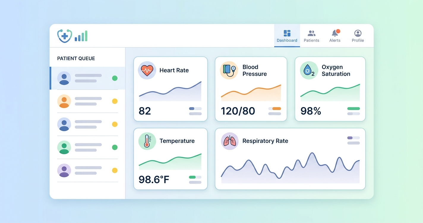
A good provider vitals dashboard telehealth teams can trust does two jobs at once. It surfaces the patients who need attention now, and it stays quiet the rest of the time. For telehealth platform companies, building this dashboard is a critical engineering and product challenge. It requires a deep understanding of clinical workflows, data visualization principles, and the underlying architecture needed to support real-time data streams. The goal is to move beyond simple data presentation and create a tool that actively aids clinical decision-making, prioritizes attention, and ultimately improves patient outcomes in a virtual setting.
"In a study of clinical dashboard use, nearly 60% of clinicians reported that well-designed dashboards improved their ability to care for patients, primarily by integrating data from multiple sources and providing trend visualization." - (Research paper on clinical informatics, 2022)
Designing the optimal provider vitals dashboard for telehealth
Building an effective provider vitals dashboard for telehealth hinges on a clear understanding of what clinicians need to see, when they need to see it, and how they need to see it. The core challenge is translating raw vital signs data, heart rate, blood pressure, respiratory rate, SpO2, into actionable clinical insights. This is not simply a matter of displaying numbers on a screen; it requires a thoughtful approach to data visualization and workflow integration. The most successful dashboards are those that feel intuitive to clinicians, providing a clear, at-a-glance overview of a patient's status while also allowing for deeper investigation when necessary.
A key principle is user-centric design. A scoping review of healthcare dashboard design practices by Løvbrekke, et al. (2021) emphasized that involving clinicians in the design process is critical. The layout must prioritize trend analysis over isolated data points. For instance, displaying a patient's blood pressure as a line graph over several weeks or months is far more informative than showing a single reading from one video visit. This allows providers to identify gradual but significant changes that might otherwise be missed. The dashboard must present a holistic view of the patient's vitals, enabling providers to assess stability and detect subtle signs of deterioration quickly.
Core tenets of vitals dashboard design
| Feature | Design Principle | Rationale & Clinical Impact | | :--- | :--- | :--- | | Trend Visualization | Display vitals as graphs over time, not just single data points. | Enables identification of gradual changes and long-term patterns (e.g., worsening hypertension) that single readings miss. | | Configurable Alerts | Allow providers or health systems to set custom thresholds for alerts. | Reduces alert fatigue by focusing on clinically significant deviations relevant to a specific patient or condition. Avoids one-size-fits-all limits. | | At-a-Glance Status | Use color-coding (e.g., RAG status) and sparklines for quick patient list overview. | Allows providers to quickly scan a list of patients and identify who requires immediate attention without clicking into each chart. | | Contextual Data | Integrate vitals data with other relevant information like medications or recent appointments. | Provides a more complete clinical picture, helping providers understand the "why" behind the numbers (e.g., a new medication affecting heart rate). | | Data Source Transparency | Clearly label how each vital sign was captured (e.g., camera-based, patient-reported, cuff). | Builds trust and allows clinicians to interpret the data with an appropriate understanding of its context and potential variability. |
Industry Applications
The application of a provider vitals dashboard extends across various telehealth modalities, from routine primary care to specialized chronic disease management. Its utility is defined by its ability to adapt to different clinical needs and workflows.
### proactive alerting and triage
Effective provider vitals dashboards are not merely passive data repositories; they are active clinical tools. The most impactful designs incorporate intelligent alerting systems. Research into clinical dashboard design emphasizes the need for proactive notifications for abnormal vital signs or significant trends (Fuselab Creative, 2023). For a telehealth context, this means the dashboard can automatically flag a patient whose blood pressure is trending upwards over several remote visits, even if no single reading crosses a critical threshold. This allows care teams to move from reactive to proactive management, intervening before a patient's condition deteriorates. The system can prioritize patients based on the severity and combination of vital sign changes, integrating directly into triage workflows and ensuring the most urgent cases receive immediate attention.
### chronic disease management
- For patients with conditions like hypertension or heart failure, the dashboard provides a longitudinal view of their stability.
- Providers can monitor the effects of medication changes remotely, adjusting treatment plans based on real-world data.
- Automated alerts can notify care managers when a patient's vitals deviate from their target range, enabling timely intervention.
### post-discharge monitoring
- After a hospital stay, patients can be monitored remotely to reduce the risk of readmission.
- The dashboard helps providers detect early signs of complications, such as infection (indicated by rising heart rate and respiratory rate) or fluid retention.
Current research and evidence
The development of provider-facing vitals dashboards is supported by a growing body of research in clinical informatics and human-computer interaction. Studies consistently show that the usability and utility of these tools are directly linked to their design. The principles of effective data visualization are central to dashboard design. A scoping review by Løvbrekke, et al. (2021) published in JMIR, systematically analyzed design practices for data dashboards in healthcare. Their findings highlight the importance of a user-centered design process, where the specific information needs of clinicians dictate the dashboard's layout and features.
For a provider vitals dashboard in telehealth, this means prioritizing trend visualization over single-point-in-time readings. Line graphs tracking heart rate, respiratory rate, and blood pressure over time are more clinically valuable than a simple table of current numbers. The use of 'sparklines', compact, data-dense graphs, can provide a quick overview of a patient's stability within a larger patient list, a technique recommended by visualization experts like Edward Tufte and adapted for clinical settings. Furthermore, the placement of information matters; critical vital signs should be placed in the top-left quadrant, as this is where users' attention is naturally drawn first on a screen (UITOP, 2023). The dashboard's ability to integrate data from various sources, such as an rPPG SDK for in-visit measurements and patient-reported data between visits, is also a critical factor in its clinical acceptance.
The future of provider vitals dashboards
The future of the provider vitals dashboard in telehealth will be defined by greater intelligence and automation. We can expect to see more advanced predictive analytics integrated directly into the dashboard interface. Instead of just showing past trends, future dashboards will use machine learning models to forecast a patient's risk of decompensation, suggesting proactive interventions. These AI-driven insights will be presented contextually, helping providers understand the factors contributing to the risk score. Integration with electronic health records (EHRs) will become seamless, allowing the dashboard to pull in a richer set of patient data and push vitals and insights back into the official record. As technologies like contactless rPPG vitals capture become standard, the dashboard will serve as the central hub for a continuous stream of physiological data, transforming telehealth from a series of episodic encounters into a continuous, data-driven care model.
Frequently asked questions
Q: What is the most important feature of a provider vitals dashboard for telehealth? A: Trend visualization. The ability to see a patient's vital signs over time, rather than as isolated measurements, is the most critical feature. It allows clinicians to identify patterns, assess the effectiveness of treatments, and detect slow-onset issues before they become acute problems.
Q: How can you avoid "alert fatigue" with a vitals dashboard? A: Alert fatigue is a real concern. The key is configurable alerting. Instead of using universal, hard-coded thresholds, the system should allow health systems or even individual providers to set alert parameters that are appropriate for specific patients or patient populations. This ensures that alerts are clinically meaningful and reduces noise.
Q: Should the dashboard differentiate between different data sources (e.g., camera-based vs. cuff)? A: Absolutely. Transparency is essential for clinical trust. The dashboard should clearly label the source of every data point. A clinician will interpret a blood pressure reading captured via rPPG during a video call differently than a reading the patient took themselves with a home cuff. This context is critical for accurate clinical decision-making.
As telehealth platforms evolve into comprehensive care delivery systems, the need for robust, data-driven tools is critical. A well-designed provider vitals dashboard is no longer a feature but a foundational component for delivering safe and effective virtual care. Circadify is at the forefront of addressing this challenge, providing the underlying technology to capture and display vital signs within any telehealth workflow. To learn more about our rPPG-based vitals SDK and explore how you can build a custom solution, request our Platform demo + SDK docs.